Creatives Who Inspire Me
Through my learning experiences in graphic design, illustration and fine art I have chosen creatives from each field who inspire me including Kate Moross, Cole Philip and Peter Paul Rubans.
Kate Moross

Kate Moross is a contemporary multidisciplinary graphic designer who works across a range of illustrative art and design including motion graphics and photography. Moross was born on April 09, 1986, in London, UK and identifies as non-binary and uses they/them pronouns. In 2008, they earned their Bachelor of Arts degree with first class from Camberwell University of the Arts. They are the art director of Studio Moross, a company that takes on music based projects, which they founded in 2012. The agency’s mantra ‘Making Music Look Good’ has lead Studio Moross to develop music videos, tv commercials and total branding systems for artists like the Spice Girls. Their created bold artworks in ads for high profile clients such as ESPN, Adidas and Nike. Some of Moross’ notable projects include a clothing range for Topshop, illustrations for Vogue Magazine and a nationwide billboard campaign for Cadbury.

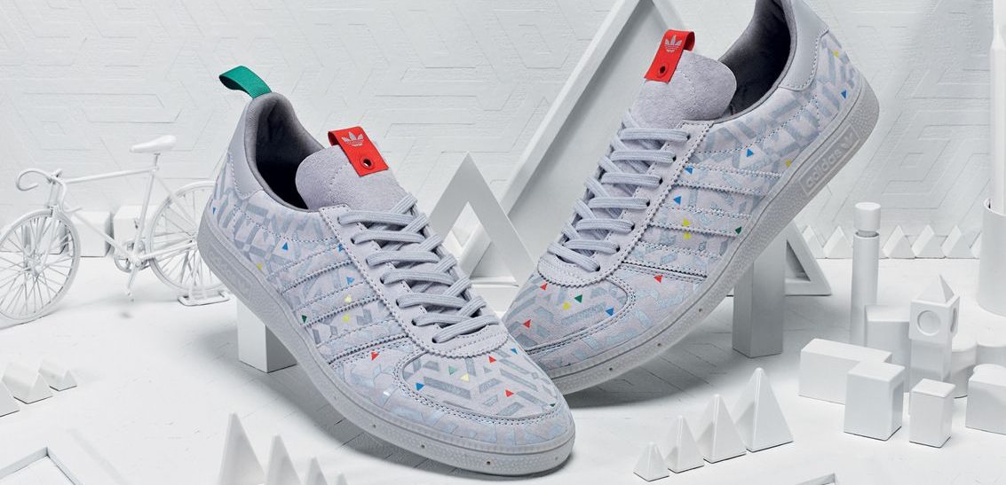
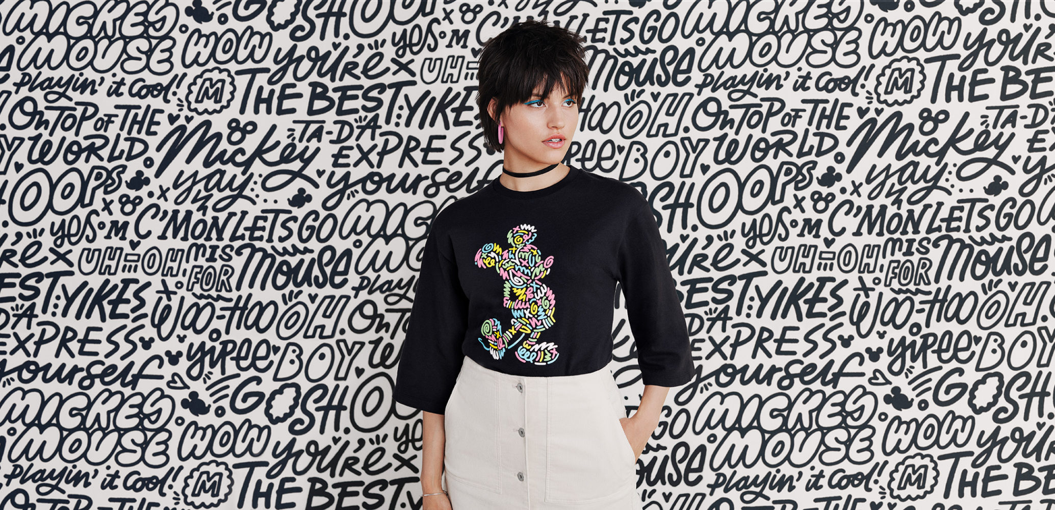
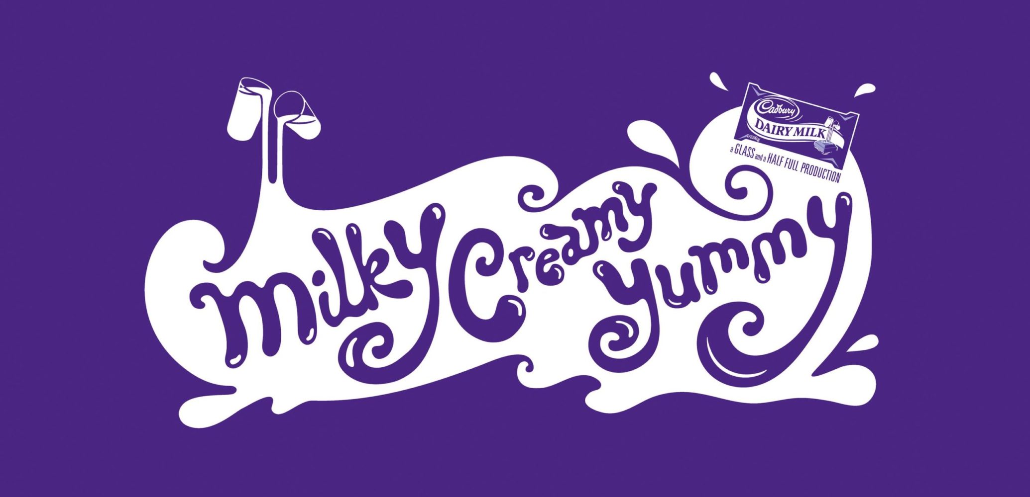
“I like originality, weirdness, simplicity…there’s nothing specific where I go, ‘Oh, this is great,… I can enjoy really macabre, dark photography as much as I can enjoy beautiful, colourful architecture. For me there are no rules about what’s good” Moross says.
They are curious, inspired by the unconventional and does not always follow the rules. This approach has made them a highly sought after in the design world. The take away from Moross is to be yourself and create work that you can be proud of.
Inspirational
Moross’ work is inspirational to me because it is exciting, bold, playful, fun, and dynamic. Their freeform lettering is organic and their illustrations including geometric pattern designs are often very colourful, which elicits a sense of joy amongst viewers. Moross’ encourages upcoming designers to do it yourself if you don’t know how, because the graphic design industry is always changing. There are new things to learn all the time and the more skills you acquire the more capable you’ll be at completing whatever job you’re given. I agree with Moross and feel the same way as a result of my post-secondary journey. You’re never done learning.
Cole Philips
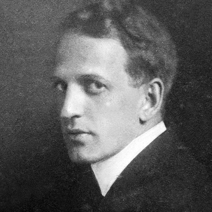
Cole Phillips (1880-1927) was an American illustrator and artist who became known for his artworks of the “Fadeaway Girl,”—an image of a detailed figure that appears to disappear into their surroundings because their clothing is painted in the same colour as the background. His technique blurred a sense of depth in the composition. Phillips worked between WWI and the late Twenties producing advertising illustrations for magazines such as the Saturday Evening Post, Good Housekeeping and Life. His work gained popularity amongst the public between “1907 and 1927, as Phillips was ranked with Maxfield Parrish, J.C Leyendecker and James Montgomery Flagg as one of the most popular illustrators in the nation,” as his work appeared in books, calendars, postcards and on other merchandise.
Inspirational
I am inspired by Phillips’ work because of his treatment of negative and positive space in relation to the figure(s) because the effect is mysterious, creates an illusion and emphasizes the elegance of his paintings. Although his paintings may look simplistic, a lot of thought went into the process especially figuring out how the overall composition would work in relation to the the negative space. I have tried creating digital paintings in this style and really enjoyed the process, especially focusing on the details in the face, hands and any pieces of clothing that are not cloaked into the background.
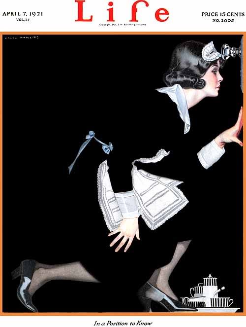
Life Magazine Cover, 1921

Artwork for Good Housekeeping Magazine, 1912
Peter Paul Rubens
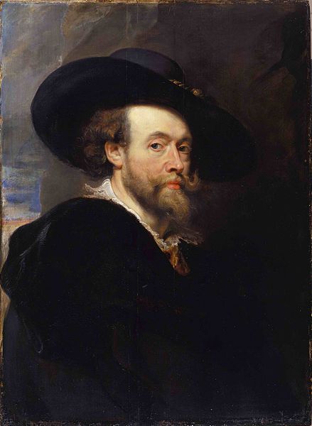
Peter Paul Rubens (1577-1640) was a Flemish artist from the Baroque era. The themes of his work related to history, religion and mythology as his clients were mostly clergy and aristocrats. He created paintings that were dynamic, dramatic and often filled with twisting human forms in largely populated compositions. His style combined Renaissance idealizations of human forms, with extremely muscular men and very curvy women, in combination with Flemish realism. His visible brushstrokes add texture to his works, and sometimes the vibrant colours in his compositions add a richness to the people or mythical characters he portrayed. Every aspect of his artworks was carefully considered as well.
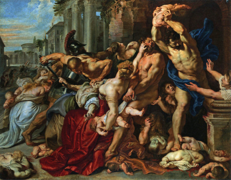
Massacre of the Innocents, 1611-12
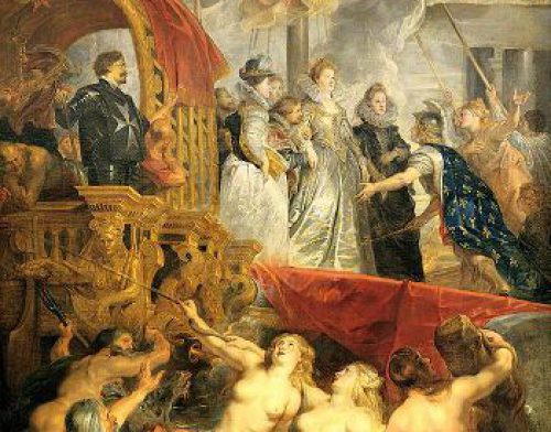
The Disembarkation at Marseilles, 1625
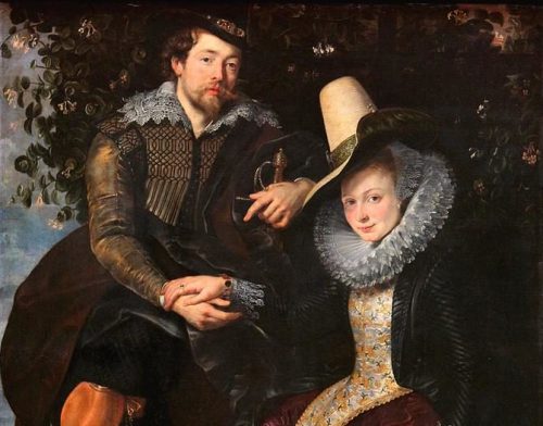
Honeysuckle Bower, 1906
Inspirational
When I use to paint traditionally I often depicted themes related to sexuality, gender norms, race and stereotypes regarding body imagery in a historical and contemporary context. Distorting the female form to emphasize the latest trend in waist training were aspects that ran through my work and I often used satire to poke fun at the body altering measures. I admire how Rubens painted scenes with large numbers of people in the composition, contorting around one another and creating a sense of movement through their actions. I tried to emulate some of his techniques in my work to enhance the concept of the illusion pop culture has made around the idealized female body. Additionally, I admire how carefully he considered the symbolism of objects, light, shadow, shapes such as diagonals for the underlying structure of his artworks. These elements are the same across fine art, illustration and graphic design. Studying what artists in the past did can influence how we approach projects today.
Philosophy
A philosophy I stand by is “you never fail unless you stop trying,” a quote I recently discovered. The message hits home personally because I have to remain motivated to achieve my goals. It’s easy to give in sometimes especially when things in life don not go as planned, but I have realized especially in the last two years that life is short and that you need to be less critical of yourself.