Create an 11 x 17 inch creative typographic report for Evergreen using two out of seven contrasts listed in Carl Dair’s “Design with Type” book, along with space. Use a grid and hierarchy to design your report.
Solution
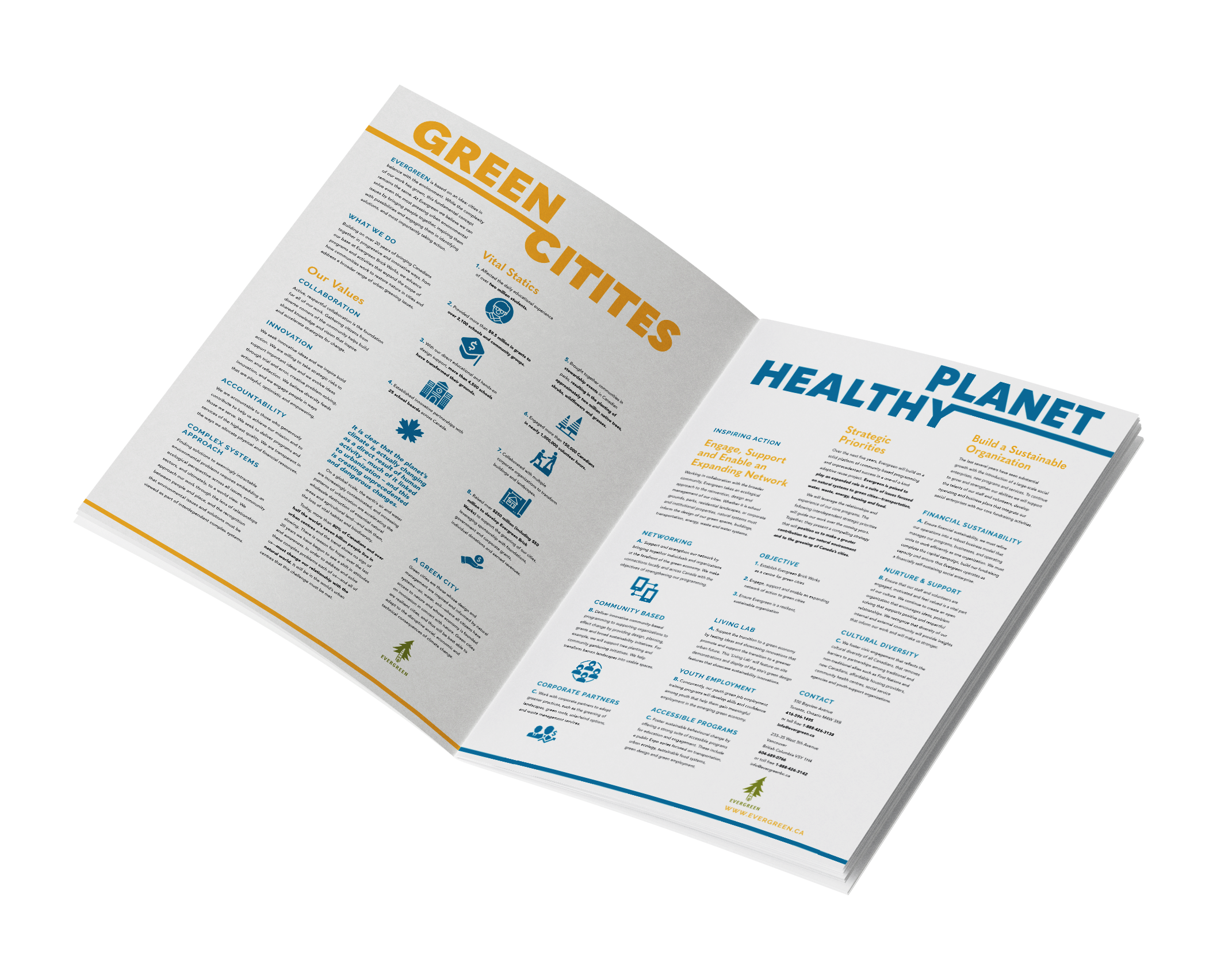
Contrast in font size, weight, colour and capitalization of headings and subheads to create a visually interesting report. The orange and blue complementary colour palette establishes a sense of harmony and balance throughout the report. A bold main headline “Green Cities Healthy Planet” grabs the viewer’s attention. Spacing between the columns creates the illusion of ascending and descending steps, a method used to create visual interest. Icons are placed in areas where statistics are shared to break up the text.
Duration: 4 Week
Process
Initial Concept
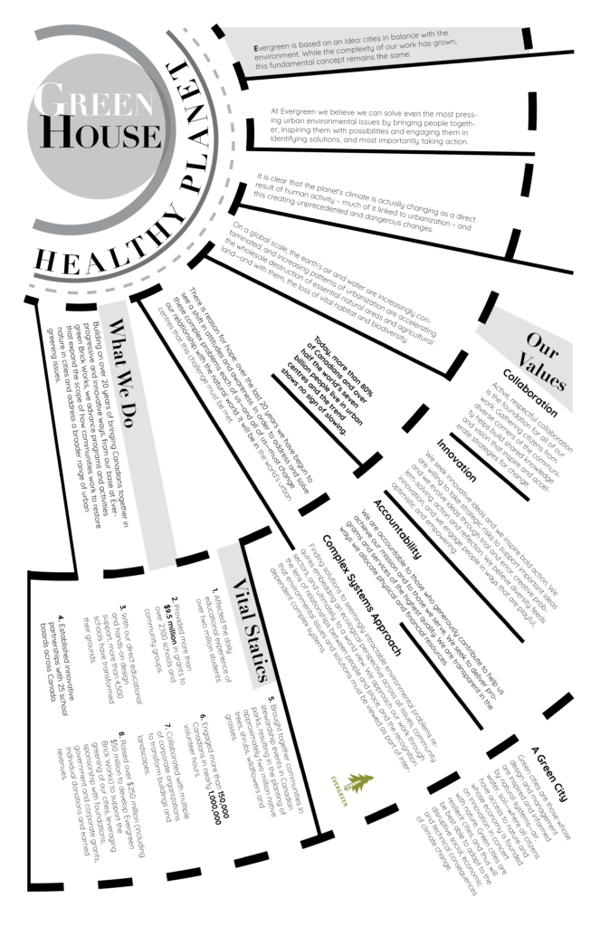
The project outline initially was to create two typographic contrast posters. I gained inspiration from layouts that were radial or had the implication of movement through their design. I paired serif and sans serif fonts to create variation throughout the posters in areas such as the headings and body copy.
I tried different colours, elements like blocks and used sans serif fonts throughout the file to update the project into the new report format. The purple and orange contrast did not suite this project and were difficult to read. The complementary colours in the final layout of orange and blue without the blocks behind the text is more legible and suitable for a corporate document. The bold headings and lines underneath the top text are eye catching. The overall harmony of colours used throughout the report help make the composition look cohesive vs the arrangement in the experimentation phase.