Collaborative Marketing Campaign
Objective
Groups will create a survival kit to ease everyday frustrations or needs of their consumers. Through research and other design thinking practices groups will aim to solve the target audiences problem. Teams will create a kit, brand name, marketing collateral, website, commercial, information graphic, and packaging.
Solution
Sillystrands is a kids hair care kit that aims to take the fear away from hair maintenance by providing a fun and safe experience between the child and caregiver. The primary target audience for the product is parents between 20-40 years old with young children ages 1-8 years old.
Duration: 14 Weeks
Group Project: Janet Bell, Cynthia Lee, Maggie Tsang, Carina Wharton & Veronica Wu

Logos
Logo and Brandmark Sketches
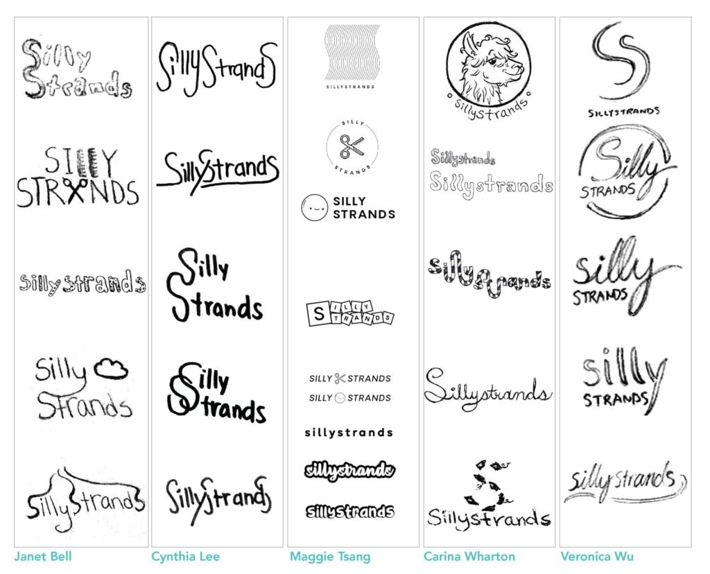
Our logo sketches were playful, unique and bold. We considered the concepts regarding styling hair and hair textures. Our final brandmark consists of connecting loops that are used to emphasize the word silly. Our branding system is made up of our logo wordmark, the cutting shears symbol, and the smiley face symbol. We also have a variety of colourful variations of our branding system.
Process
Brandmark


Branding System
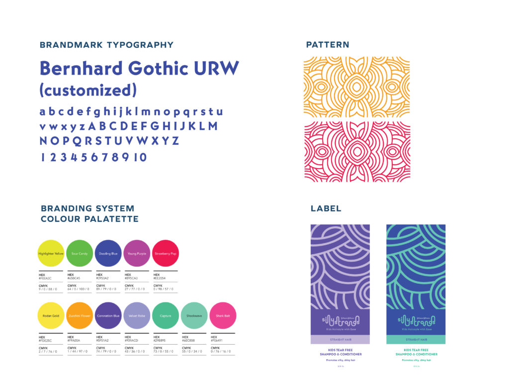
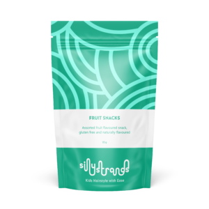
The typeface used for our logo and consistently throughout our brand elements is Bernhard Gothic. Our Brand Colours are fun, youthful, vibrant and exciting. Our broad palette consists of colours that are energetic and appeal to both adults and children. Some of our colour names are Velvet Robe, Shark Bait and Zucchini Flower. Our brand Pattern is a prominent aspect of our branding. The pattern is intended to represent strands of hair in a playful manner and are positioned in a circular display. Our labels are clean for easy legibility, and do not contrast with our patterns.
The design elements help reinforce the product information as a visual aid while reinforcing our keyword FUN-functional, Universal, Necessity. The imagery creates a continuous pattern when placed together on the shelf and suggests movement.
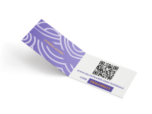
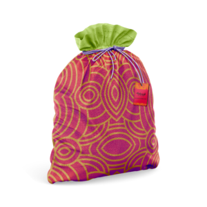
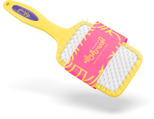
Products
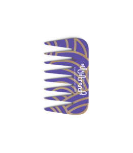
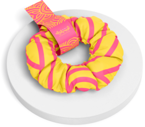
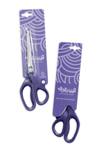
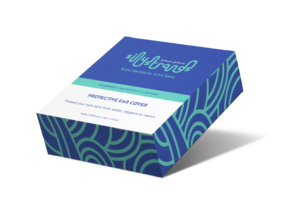
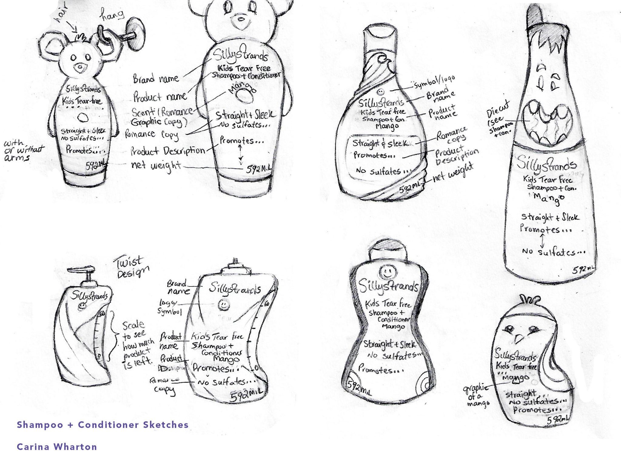
Process Sketches
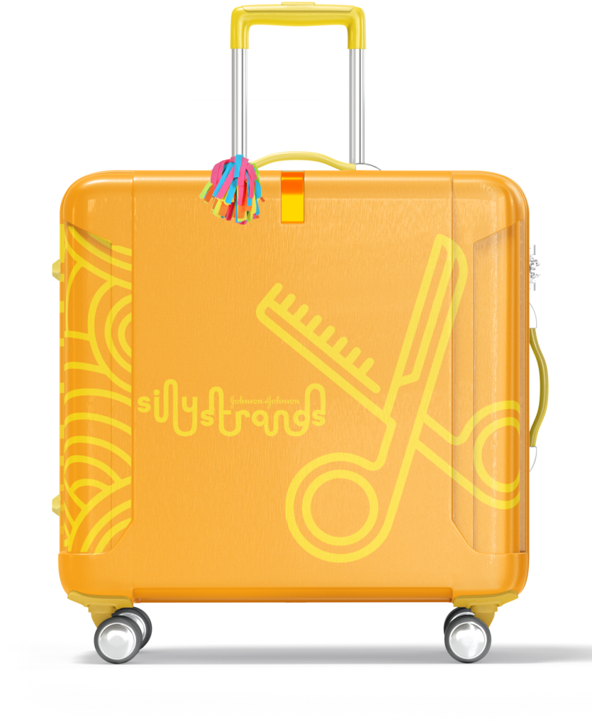
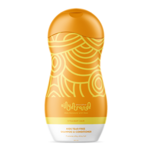
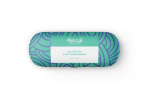
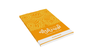
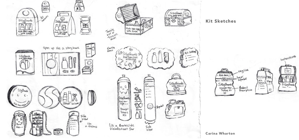
Initial ideas for the kit container included aesthetics that would appeal to children such as a treasure chest. Incorporating characters onto the packing and kit was considered as well. We choose the suitcase as our final because it is reusable, can be used for traveling and is easy to roll. The packaging for our products and kit remained simple with the use of our brand pattern. These exploration sketches could be used for future products as the company grows.
Retail Space and Merchandise
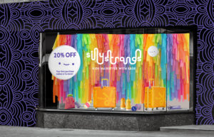
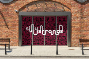
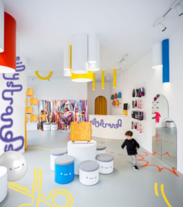
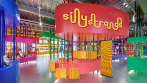
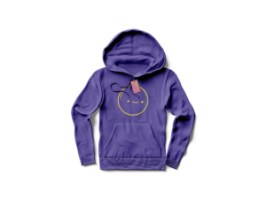
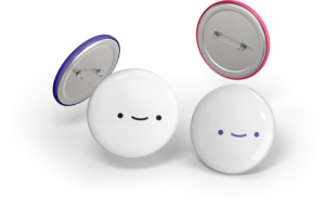
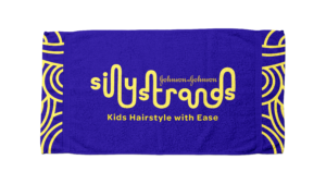
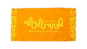
This is a pop up shop retail space that will be located in Toronto. The space will be an inviting atmosphere with interactive elements for kids. The interior will be colourfully decorated with our branding and shelf displays, floor stands, and counter top displays will be used to display our kits and individual items for sale. Our window display is designed to capture the attention of people passing by as our pattern surrounds the outside of the building. The display has an assortment of products found in our kit, with rainbow coloured streamers in the background and our smiley face symbol as a window decal which advertises our latest promotion to shoppers. Additionally, our symbols, pattern and logo work well on almost anything, which gives us a variety of options for merchandise.
Campaign
Objective
Present a three page document outlining a pre-event strategy, event strategy and post-event strategy relating to the product launch campaign for the survival kit. Introduce the theme, create posters, list three medias that will be used to advertise the events and explain the strategy for attracting the target market.
Solution
A series of events that are family friendly and fun which will promote our product and introduce who we are as a brand to the public. Media used to increase awareness of our product will include celebrities/social media influencers, broadcasting corporations such as Corus Entertainment, and an online presence.
Pre-Launch Event
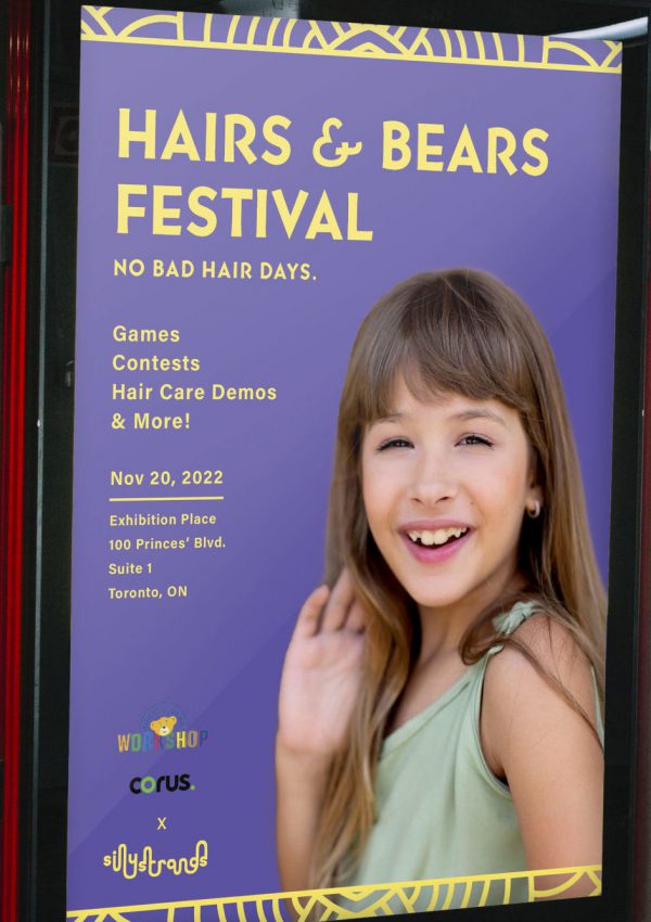
Pre-launch includes giving free kits to influencers such as the Busby Family to demonstrate the tools in the kit to their followers on social media.
Event Strategy
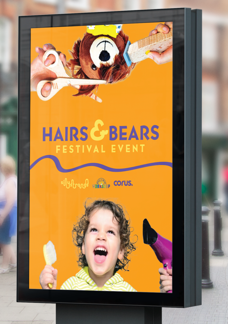
The launch event is a festival where families and kids can enjoy live entertainment, free beverages and food, test out our products with hair stylists on hand and win prizes.
Post-Launch Event
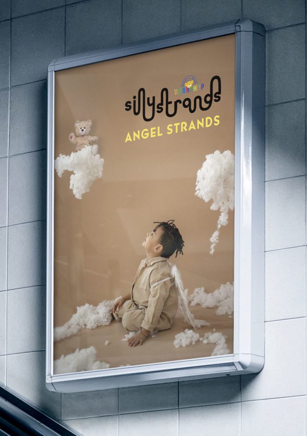
The post-launch will be an annual collaboration event with A Child’s Voice Foundation’s Angel Hair for Kids, a Canadian charity that arranges ponytails and monetary donations to create wigs for children with cancer.
Commerical
Objective
Make a commercial for your group’s CMC survival kit that promotes the brand. Feature a variety of animation techniques.
Solution
Our commercial features our kit, products and a follow up at the end for viewers to visit our website for more information. In brainstorming we wanted our commercial to represent how fun our brand was through visual effects and upbeat music. We decided to keep the look of our commercial illustrative to emphasize the child-like appeal of our kit which is targeted towards kids and their parents. We used effects such as linear wipe, shape morphing, 3D effect, trim path, masking out and block dissolve to achieve our desired look. Learning outcomes included conceptualizing a motion video, storyboarding and using different visual effects to tell a compelling story.
For more information on the elements used in the CMC project please check out the Case Study.